Design is a huge component of digital marketing. For all the social platforms, emails, resources, and product guides — marketers need strong images. If you’re a lucky marketer, you have a creative agency on the payroll that delivers high-resolution, sophisticated images for ad campaigns. If you’re on the scrappier side, there’s a good chance that you’ll have to design images yourself.
Luckily there are a plethora of tools out there that make it easy to make your own image such as Canva which supply both the imagery, text, and coloring options. If you’re interested in creating something from scratch, you can also use a tool like Adobe Illustrator or Photoshop. But working with the right tools is just a start. You’ll find that while these programs make creating images faster, creative design for marketing can still be a challenge.
Here are the seven steps to creating brand content and imagery for digital marketing:
Find the right size
It’s important to keep in mind how images will display when linking to your blog or content. For example, does the platform cut off images that are too tall or stretch out images that are too thin? For our featured images we go with 1200px by 630px which we’ve found to the dimensions that work well across platforms. Scraawl marketing posts primarily on Facebook, Twitter, and LinkedIn, with some posts on YouTube. Having a consistent size really cuts down on the amount of work.
If you’re working within Illustrator or any Adobe product it’s easy to set the height and width when creating a new product. In the figure below you’ll see the dimensions options to the right side.

Once the image dimensions are set, you can start thinking about the elements of your design, starting with your branding.
Work with clear branding guidelines
If your brand has a visual style guide, use it! Visual style guides are the bible when it comes to your brand’s marketing. They often state rules for placement, sizing, and color of your logo. Additionally, they offer guidance on the appropriate color palette for branding materials and images.
If you’d like to look at an a example YouTube’s Brand Resources is a great page that clearly elucidates what can and cannot be done with their logo. As a result, YouTube’s logo remains consistent, even if used by a multitude of content creators.
But what if your brand is, well, brand new and does not have a visual style guide? Instead of drifting off into a design abyss where everything is comic sans and magenta, let’s take a look at the next step, picking your colors.
Stick to a limited color palette
It can be tempting to start putting images together and then deciding the color later. I recommend starting with a color palette in mind so you force yourself to stick to those colors throughout the process. To help designers choose complementary colors, there are sites like Coolors (below) or Adobe’s Color Wheel.

I also recommend working with a very limited color palette because it’s more cohesive. Every color should be designed a purpose as well, at least to start. Sure design can be
whims ical and fun, but if it doesn’t ultimately serve the greater purpose of your image, are you really creating a useful graphic?
Now when thinking of colors, it helps to think of the target audience as well. If your brand’s customers tend to be older and more professional then darker blues, grays, and neutrals give off a more serious tone. If you have hip crowd then bright, vibrant hues like millennial pink and jade green might be more appealing to them.
With that in mind, start with a title, background, and accent color. You can always play around with these more later, but this is a good place to start.
In Layouts, simple may be better
Now that you have some sense of the colors you’re working with, gather up the elements you’d like on the page such as logos and text. Don’t place too many elements on your workspace at once. It can get crowded quickly, especially with bright colors and with text. It’s best to try to keep layout simple by keeping to the rule of thirds and adhering to safe zones.
Rule of Thirds
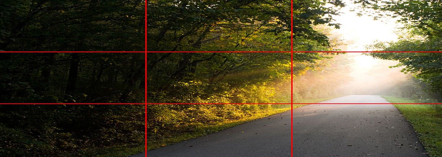
(Image Source: The Rule of Thirds: Know your layout sweet spots)
Let’s say you were to evenly space out two lines horizontally to create three rows, and then did the same vertically, you would end up with a grid. The beauty of the Rule of Thirds is where these lines cross. These four intersection points are areas of visual interest, and are where the eye is drawn. The Rule of Thirds can help determine how to compose a photo or where to place an element.
Safe Zones
You may have also heard of safe zones. Above we mentioned the importance of sticking to consistent dimension sizing. It’s also important for similar reasons to give “gutter space” and margins. This use of negative space allows the graphic to breathe. When creating featured images for blogs, an 50px margin all around is a good rule of thumb.
Other tips
The eye naturally draws itself to top left-hand corner due to the way humans intake visual information. We tend to read pages in a Z- formation, from the top left corner to the top right corner, diagonally down to the bottom left corner and ending with the bottom right corner. With this in mind, we like to place our Scraawl logo in the bottom right corner, so it’s the last element the viewer will see.
Typography is your friend
Have you ever seen Helvetica the documentary? If you haven’t, just know that there are those that are very, very passionate about fonts and typefaces. This could be a much longer conversation but here are some quick facts:
-
Selecting Weights – Emphasis in text can be illustrated with bolded font and then contrasted with a thinner choice.
-
Selecting Size – Optimize sizing for legibility. It can be hard for some to read cursive fonts so increasing the size can help.
-
Selecting Font(s) – Mix serif with san serif fonts, but no more than two.
Flat or photo?
Another consideration when creating an image is whether to go flat or go with a photo, if not a combination of both.
 An example of a flat design versus photo based design.
There are some benefits to working with flat images. One, you can control image quality with ease. The scalability of vector illustrations helps to keep lines crisp. Two, there’s also the price element. High quality images can be expensive. There are also creative commons images that can be used for free, but these images are often low quality and hard to find. If you can create the vector in Illustrator, you can save yourself time by quickly mocking-up exactly what you want instead of paging through image results.
But people love people, and smiling human faces are considered to be the most appealing for advertising. Choosing between flat imagery or photos is also a question of branding as it as much about resources. If your brand or blog is all about human connection, then content should drive the design.
Balancing quality and size in exporting
With images for content it’s always a balance between quality and sizing. Exporting your image to a PNG-8 can help keep it under 100k but be sure to watch out for color loss and graininess. For some, depending on what hosting service or CMS you use, you may find it best to upload near max-size and then resize later within your blog. I prefer to upload at the exact size I would like to see for display because our blog site does not use a compression widget.
There is so much more that can be said about layout and design, but for marketing purposes it’s always good to remember three things – your branding, your audience, and to have fun!
Interested in finding out more? Luckily a starter account with Scraawl is absolutely FREE. To access your free social and news data analytics, sign up here.